VCIS Logo System
design LOAD VERSION::v1.0.0

VCIS Logo System

Creating a school identity system that stays recognizable across the public website, the LMS, and compact favicon use

Final Solution
PRODUCT IMAGE

EXECUTIVE SUMMARY

01. THE CHALLENGE

The school needed a visual identity that could work consistently across two live digital products with different constraints: a public-facing marketing website and a login-driven LMS. The primary logo needed to feel institutional, memorable, and polished at full size, while the favicon had to preserve recognition at a much smaller scale without becoming visually noisy or unreadable.

02. MY SPECIFIC ROLE

Brand and logo designer responsible for the school mark, digital logo system, and favicon adaptation used across the website and LMS.

03. FINAL OUTCOME

Delivered a reusable logo system deployed across 2 live school platforms: the main Vine Crest Schools website at https://vinecrestschools.com and the VCLearn LMS at https://learn.vinecrestschools.com. The final work includes a full primary logo for page-level branding and a favicon variant optimized for compact interface use in the LMS.

The Recognition Insight

"The key insight was that this was not just a logo design task. It was a recognition system problem. The brand had to hold up in two very different contexts: full-size presentation on a school website and tiny interface-level display inside the LMS. That meant the strongest solution was not simply a detailed crest, but a logo family with a clear primary mark and a simplified favicon adaptation that preserved the same visual identity under tighter space constraints."

From Full Identity to Compact Mark

A major design iteration was translating the school identity into a favicon that still felt unmistakably connected to the main logo. The primary mark could afford richer visual detail and ceremonial presence, but the LMS favicon needed to work at a glance inside tabs, bookmarks, and browser chrome. The solution was to retain the most recognizable visual cues from the main identity while simplifying the composition for small-scale clarity and digital legibility.

Before Iteration
After Iteration

Live Brand Usage

OPEN IN NEW TAB [↗]
INTERACTIVE PREVIEW MODE

Results & Reflection

Live Platforms

2 production surfaces using the identity system

Primary Deliverables

Main school logo and LMS favicon

Brand Consistency

Shared identity across website and LMS

Compact Readability

Favicon adapted for small-scale recognition

SYSTEM RETROSPECTIVE // LESSON LEARNED

Strong identity design for digital products is not only about creating a beautiful logo. It is about deciding what must remain recognizable when the brand moves between large hero placements, navigation areas, authentication screens, and tiny favicon surfaces. The best logo systems are designed for flexibility from the start, not adapted as an afterthought.

<< Identity System Decisions // FOR DEVELOPERS & STRATEGISTS >>

STRATEGIC TRADE-OFFS

The central trade-off was between richness and clarity. A school logo benefits from detail, symbolism, and formality when presented at larger sizes, but those same qualities can break down in small digital contexts. Preserving too much detail in the favicon would reduce recognizability, while oversimplifying the primary mark would weaken the school's visual presence. The final system balances both needs by allowing the full logo to carry more expression and the favicon to prioritize instant recognition.

THE MESSY MIDDLE

A common failure pattern in identity work is trying to shrink the full logo directly into favicon use without redesigning it for scale. That approach usually produces clutter, weak contrast, or indistinct shapes in browser tabs. The stronger direction was to treat the favicon as a deliberate brand adaptation, not a miniature screenshot of the entire logo.

ADDITIONAL DEEP DIVE RESOURCES

Overview

Vine Crest School Logo System is a brand identity project centered on designing the visual mark used across the school's public website and its VCLearn learning management system.

The work includes a primary logo for full-size brand presentation and a favicon variant for compact LMS use. Together, they create a small but important identity system that keeps the school recognizable across different digital touchpoints.

Problem

School brands often need to function in very different interface environments. A logo may appear in a website header, on a sign-in screen, in browser tabs, or in platform shortcuts. Designing one mark that works equally well in all of those spaces is difficult because each surface has different visual constraints.

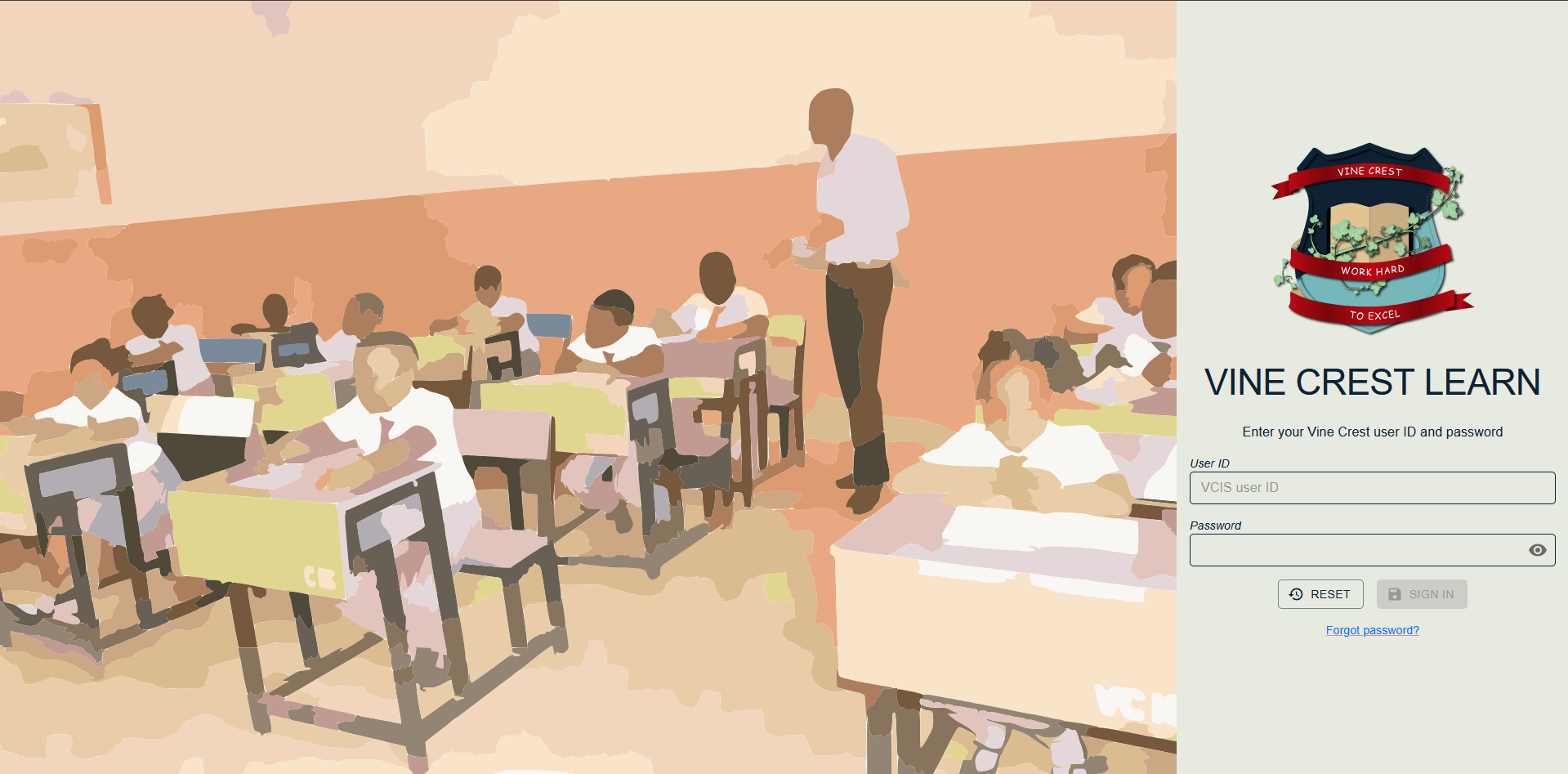
For Vine Crest, the challenge was to create a brand mark with enough presence for the public-facing site while also ensuring the identity stayed clear and recognizable inside the LMS, especially at favicon size.

Approach

The project was approached as a digital identity system rather than a single isolated asset. The full logo was designed to establish the school's visual presence on the website and LMS, while the favicon was treated as a compact adaptation focused on fast recognition.

This meant prioritizing the most durable brand cues and preserving them across both versions. Instead of forcing every visual element into the smallest format, the work focused on clarity, consistency, and practical digital use.

Outcome

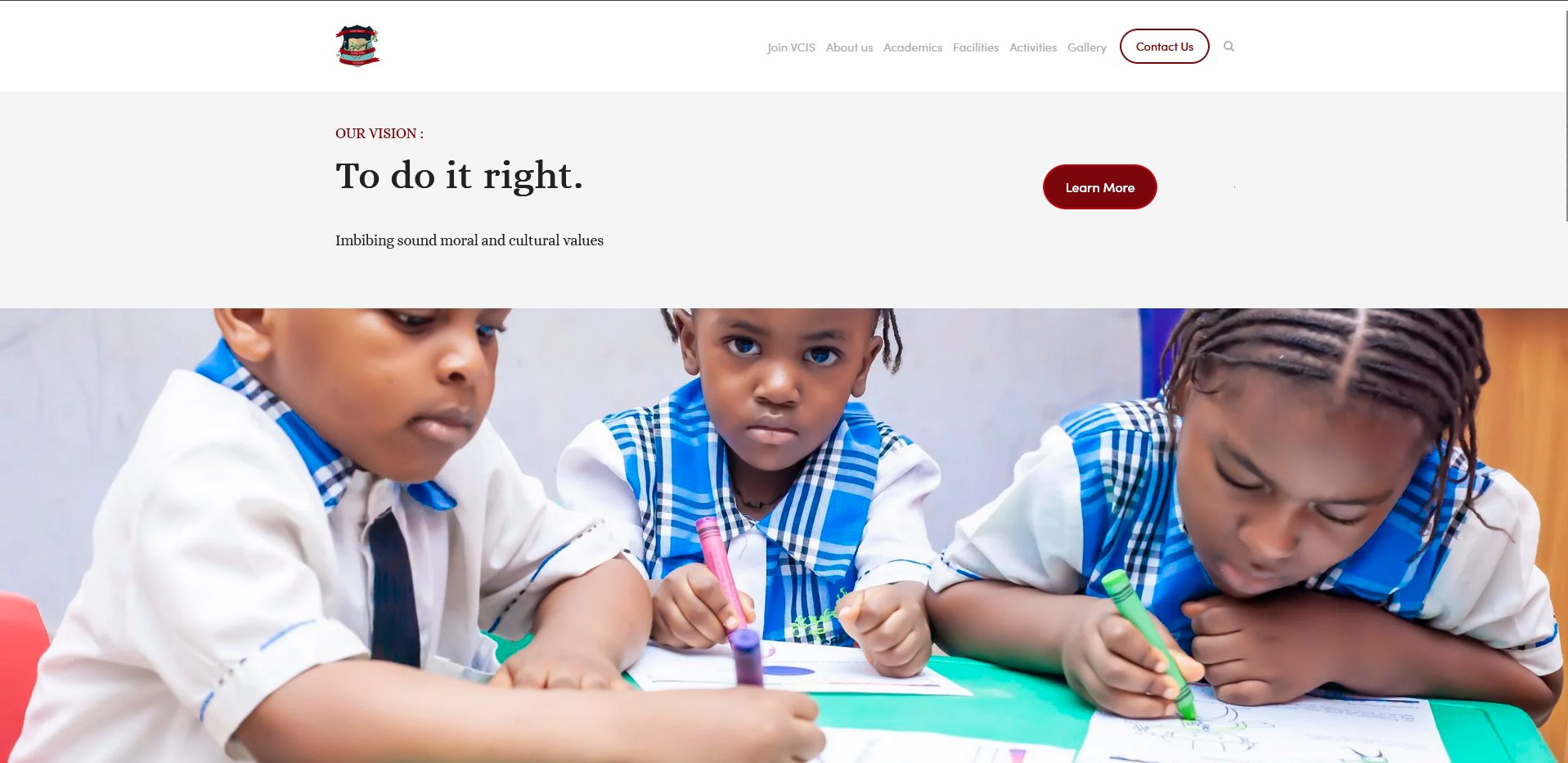
The final deliverables are now used on two live school properties:

The result is a cleaner and more cohesive digital identity across both platforms, with a full logo that supports formal brand presentation and a favicon that remains readable in compact interface contexts.

What This Project Demonstrates

This project highlights a useful design principle: identity work becomes stronger when it is planned as a system.

It shows:

  • brand thinking across multiple products
  • logo design for different display sizes
  • practical adaptation from primary mark to favicon
  • digital-first identity decisions rooted in real usage

Key Takeaway

The most valuable part of this project was designing for recognition instead of only decoration. A successful school logo system needs to feel credible at full size and still remain unmistakable when reduced to its smallest digital form. That balance is what makes the identity effective in everyday use.